To explain, my work based on a paper by a team of researchers at Cass Business School entitled The Trend is Our Friend: Risk Parity, Momentum and Trend Following in Global Asset Allocation suggests that when the market is experiencing an uptrend, you should go for broke and buy the "hot" sectors of the day. On the other hand, when the market is falling, buying the "hot" sectors is a recipe for disaster.
A risk friendly market trend
First of all, my trend following and momentum models is pointing to a risk-on market. Consider the relative returns of SPY (stocks) against IEF (7-10 year Treasuries) below. Unquestionably, we are seeing an uptrend in the risk trade:
The risk-on trade isn't just restricted to stocks vs. bonds. The same effect could be seen in the credit market, where junk bonds are outperforming:
Defensive leadership
Here is what's bothering me. We are obviously seeing an uptrend in the stock market, as evidenced by the new highs. However, sector leadership is gradually shifting away cyclical sectors to defensive sectors and industries. Take a look at what the leadership is today.
The chart below shows the relative returns of Financials (XLF) against the market (SPY). Financials are in a well-defined relative uptrend against the market.
Here are the Transportation stocks, which is a small cyclically oriented industry. These stocks are also in a well-defined relative uptrend.
OK. So far so good. Now here comes the surprises. Look at the relative strength in Healthcare:
...and the turnaround in the relative strength of Utilities:
Commodity cyclicals lagging
I have written that cyclical sectors are displaying a pattern of relative sideways consolidation after an uptrend (see An uncomfortable bull). I won't repeat myself, but you can click on the link and see the charts there.
What's bothering me is that commodity related sectors are lagging badly. Consider the equal-weighted Continuous Commodity Index, which is in a minor downtrend. Though it doesn't seem disastrous and commodity prices have firmed somewhat in the past three weeks, the price action of the commodity complex is not exactly signaling a robust global recovery.
On the other hand, the price action of industrial metals look downright ugly.
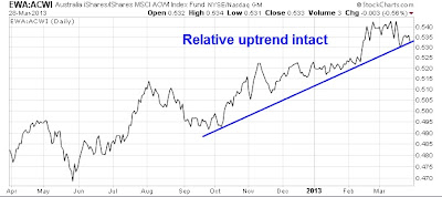
Here are some price relative charts of commodity sensitive stock markets against ACWI, or the MSCI All-Country World Index. Australia looks ok, but it's the exception.
Canada, on the other hand, is in a relative downtrend and has been underperforming since last November.
Here is Brazil. Enough said here:
Here is the relative chart of South Africa (in black), though its relative performance may be linked to the relative performance of gold stocks (in orange):
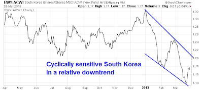
The relative performance of the cyclically sensitive South Korean market is not exactly inspiring either. South Korea remains in a relative downtrend, though it has staged a relative rally in the last week or so.
What's going on?
Frankly, I am puzzled by the nature of the sector leadership when the market is making new highs. My momentum and trend following models are telling to stay long. My relative strength models are telling me to rotate into defensive sectors like Utilities and Healthcare. When I net this all out, I wind up in a fairly neutral position.
Something's not right about this rally. Mohamed El-Arian of Pimco pretty much said the same thing when he indicated that the Markets are sending unusual signals [emphasis added]:
The rally reflects slowly-improving economic conditions, relatively robust corporate profitability and anticipation of stronger domestic and foreign inflows into the equity market. Yet this is far from the whole story.More on this topic in subsequent posts.
Investors need only look at where some other benchmarks ended the quarter to get a feel for the unprecedented and artificial nature of today's capital markets.
Few would have predicted that the impressive equity performance would be accompanied by a 10-year U.S. Treasury rate as low as 1.85 percent, a 10-year German government bond (bund) rate as low as 1.29 percent and gold as high as $1,596 an ounce. Think of this as the markets' way to signal to investors some key issues for the quarters ahead.
Cam Hui is a portfolio manager at Qwest Investment Fund Management Ltd. ("Qwest"). This article is prepared by Mr. Hui as an outside business activity. As such, Qwest does not review or approve materials presented herein. The opinions and any recommendations expressed in this blog are those of the author and do not reflect the opinions or recommendations of Qwest.
None of the information or opinions expressed in this blog constitutes a solicitation for the purchase or sale of any security or other instrument. Nothing in this article constitutes investment advice and any recommendations that may be contained herein have not been based upon a consideration of the investment objectives, financial situation or particular needs of any specific recipient. Any purchase or sale activity in any securities or other instrument should be based upon your own analysis and conclusions. Past performance is not indicative of future results. Either Qwest or Mr. Hui may hold or control long or short positions in the securities or instruments mentioned.


1 comment:
If you were looking, there have been signs all the way back to March 2009 that "something is not right" about how the markets are behaving. That something is the Fed.
It's really very simple. The Fed prints increasing amounts of money and stocks go up. On the two occasions where the Fed has stopped - after QE1 and 2 - markets immediately started crashing. They can't even slow down anymore. They went from QE3 at 85 billion per month to QE4 at $140 billion per month in 6 months.
Buy all the stocks you want, but don't call it investing.
Post a Comment